Logo Optimization
CLIENT
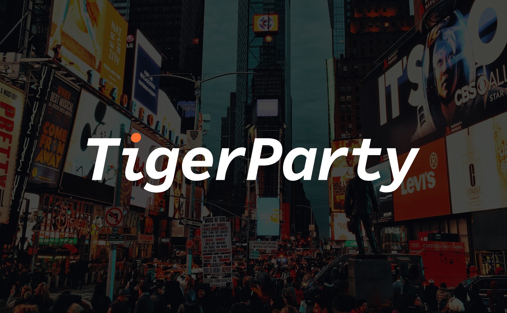
Tiger Party
SERVICES
Logo Design

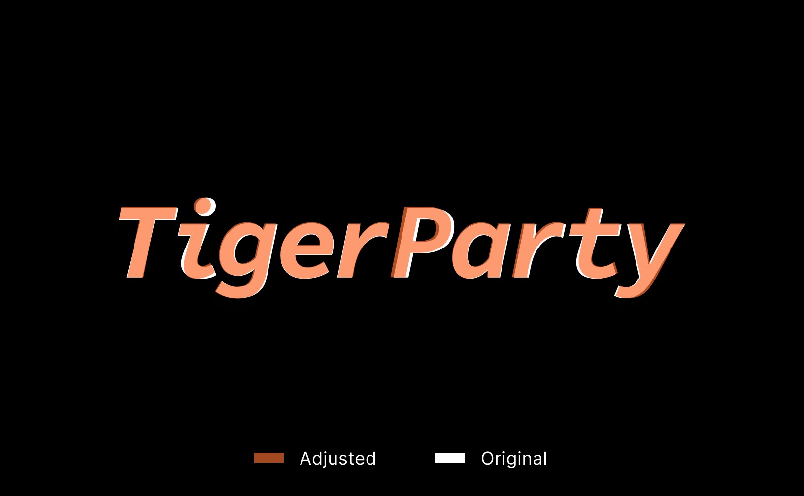
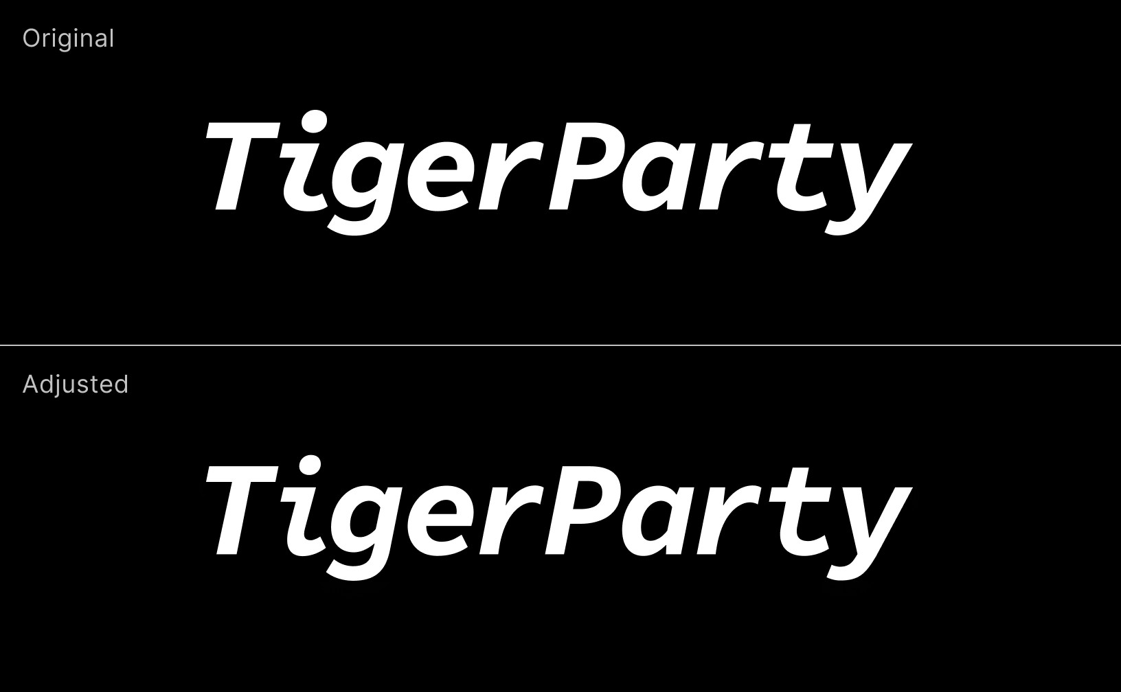
A logo refinement for Tiger Party, enhancing visual clarity and balance while preserving its creative identity. The enhancement positions the brand with a more professional, high-end image to appeal to enterprise clients.
ABOUT THE PROJECT
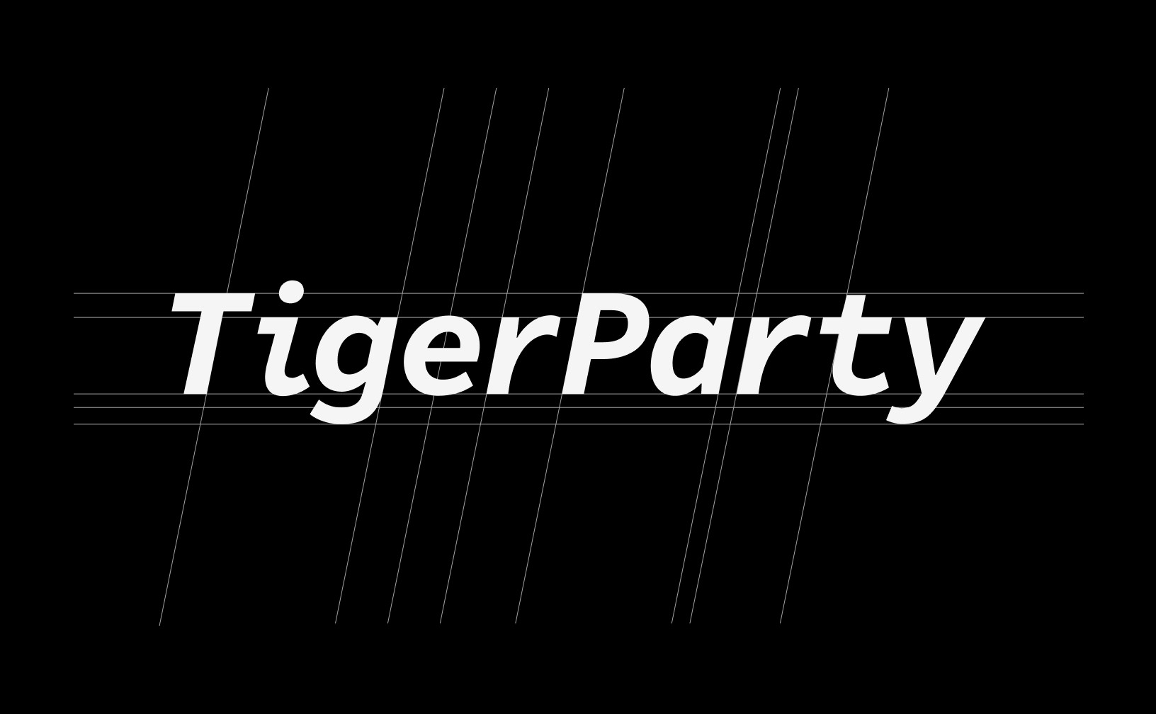
This project focuses on refining the logo of Tiger Party, a digital billboard and creative services provider. Enhancements were made to improve visual harmony and precision—reducing excess anchor points, aligning slopes, fine-tuning kerning, and smoothing curve transitions for a cleaner, more balanced appearance. Key elements—such as the orange dot and the extended bottom stroke of the “i”—are preserved to retain the brand’s distinct personality. These features highlight the company's creative edge and its expertise in the art and creative industries. The refinement aims to reposition the brand for enterprise clients, reinforcing a professional, high-end image while preserving its dynamic, imaginative spirit.